|
During this burger tutorial I learned a lot more about how to make specific shapes and how to arrange them in the correct order so the correct things are in front of each other, I might have messed up a few items while in the production but I was able to remake them. While making the fries I accidentally added a stroke that was too thick for them, I decided to use the smallest stroke on the finished fries now because I wanted them to look more crispy and finished instead of just logs in the cup, I chose more of a red black and white color scheme because that's what I think of when I think about retro kind of diners and older restaurants. I really enjoyed finishing this activity and had a lot of fun making my menu. 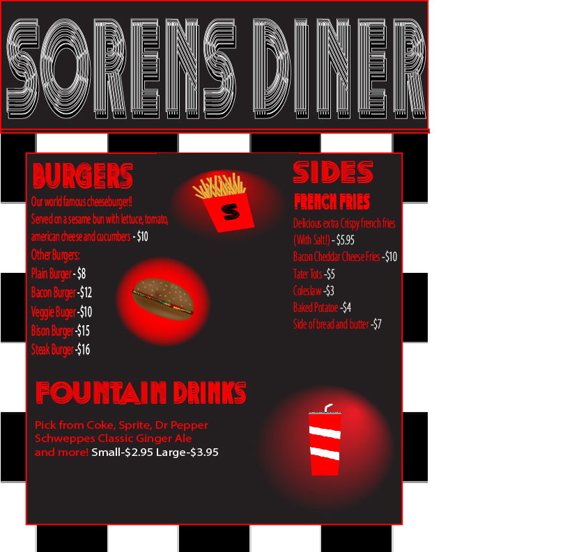
0 Comments
In the Four Icon Challenge I learned how to make more complex shapes and how to change what layer they are in, the shape editor was confusing at first but after I made the Train I got a hold of it, the diamond was hard because I couldn't move the edges that are king of pointing out but its fine, the book I chose was Harry Potter and the Sorcerer's stone which I put a wand, the Hogwarts train, the Sorcerer's stone, and the The Mirror of Erised. 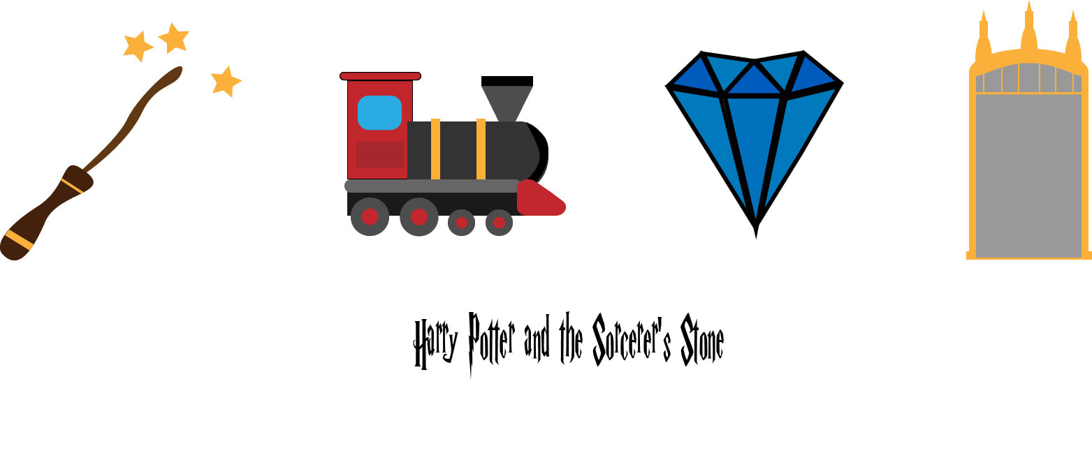 For the Elements of design, I decided to take pictures of a painting on a wall for color, it included many colors that can represent this element. For space I took a photo of the space between two chairs since it showed them being separated and the space between the two. The element line I chose to do a photo of a line of tape on the floor that was blocking something off, this was a good photo for a line. For texture I put a picture of the wall, it showed the different type of texture that just flat, it was very bumpy and had divots in it. For shape I chose a picture of the Japanese flag since it showed a perfect shape, a circle. For scale I put a picture of books on a bookshelf, I thought that this showed the scale of the books and the bookshelf which showed the size of both. Principles of Design -Contrast, I used a photo of the courtyard since it was showing lots of colors and with the blurr of the closer up things like the railing. -Repetition, I decided to take a photo of 3 blue chairs being placed in a row to make a repetitive view. -Alignment, I Took a picture of an equal looking shape on both sides, the bench was aligned directly with the front door area so it was perfect for alignment. -Proximity, I used a photo of the bricks on top of each other with the same proximity as the other, the area between each brick was a good choice for proximity. -Proportion, I chose a picture of the keyboard, the different shapes of the keys made sense to me for Proportion. -Emphasis, I used a picture of an arrow pointing at a barcode on the tv, it was emphasizing the barcode so I thought it was a good choice for Emphasis. -Rhythm, I used a picture of the lockers next to each other, I thought that this showed a good example of rhythm through the locker since they were all perfectly placed next to one another. -Balance, I used a picture of the balance of the black and the yellow, I thought that both colors were used good here and there was a feeling of balance between the two colors. 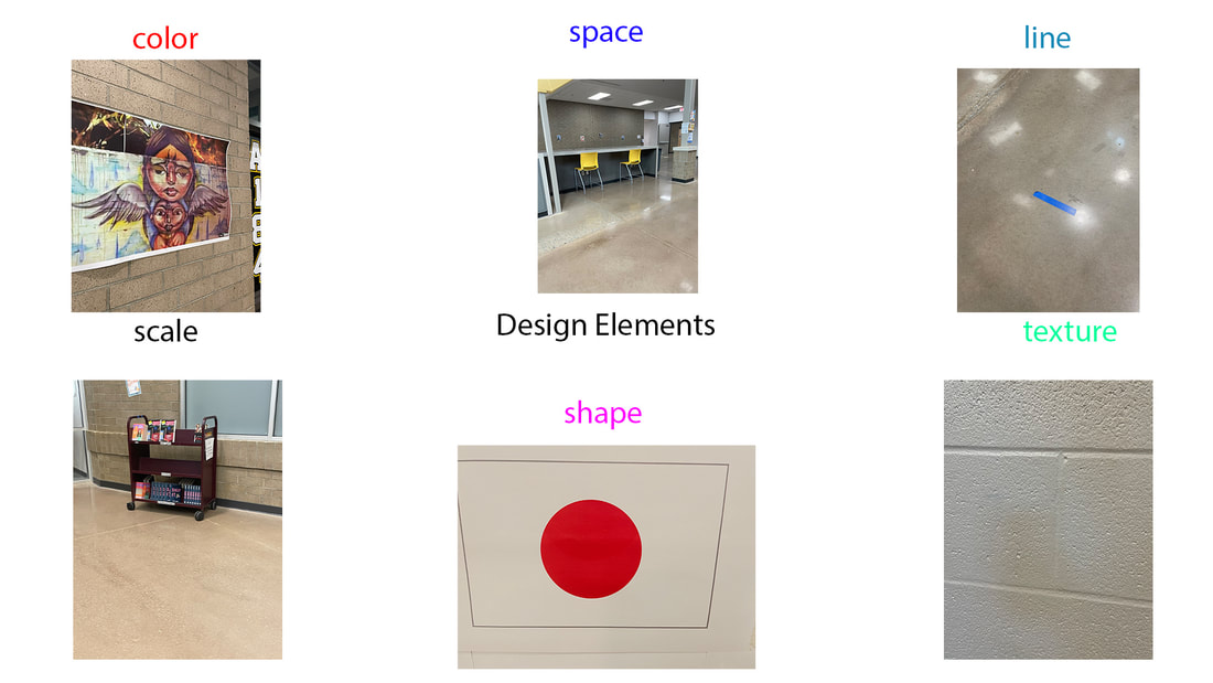 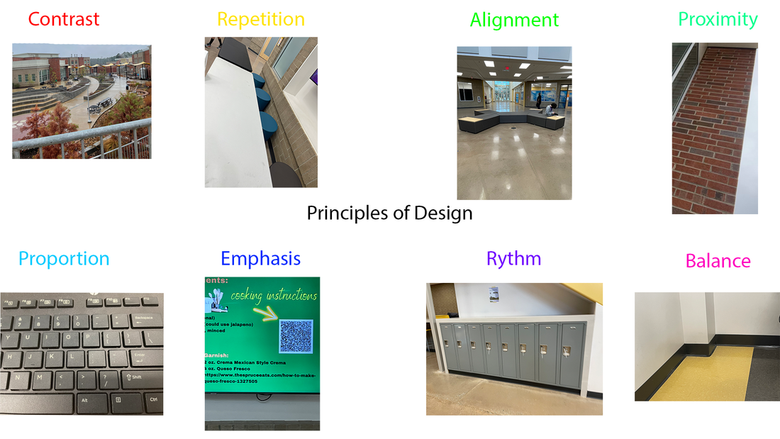 |
